
John Stezaker. Both of the images that are joined together, and by the look of them it seems as if it had artificial light focused on both of them, however they are placed in different angles. I think this because his face is clearly in focus of the light as it's bright, however the woman on the right has quite a lot of tones showing on her face, but a lot of light focused on her top. Therefore, the light came from the bottom not front, which created a bright looking top, and tone on her face. It's a simple portraiture style, with the object right in the middle of the image, creating an equal amount of space around them. That made the job much easier for Stenzer as he decided to match them together to create one, unique photograph. By their clothing and colour of the image, it is clear that it presents an old style, because the clothes are quite old fashioned, plus the image has been either done or edited to black and white, creating that impression either of serioussness or the 8o/9o's. I personally love the image as it kind of reflects back to 8o/9o's, and i really like the fashion they use to have and music, therefore I also enjoy looking at such photographs that relate to them. The formal elements are essential in this photograph as if anything would be changed, for example if the image was in colour, my imression wouldn't be of 8o/9o's but of XXI century photography, made purposely to show these times. Therefore the formal elements are also significant in taking a photograph. I don't think a tripod was needed as the picture came out very clear, and people in it don't look tired at all (as when using slow shutter speed it takes a while for it to take a photograph, in cause of that people may get tired of staying in the same position for a long while), threfore a fast shutter speed had to be used, which doesn't need the help of a tripod. Howver it's clear that the images have been edited because no camer does such images by it's own. When the artist made this, in my opinion they focused on the gender difference, because he combined a man with a woman together.
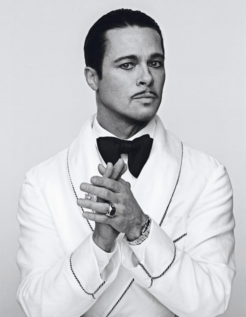
Steven Klein. Very similar technique used in this image as well as the one above. This is because of the use of black and white colour, and the style Brad Pitt has been dressed in, again reflecting the 8o/9o's 'posh' style, mailny used by the ones who could afford such clothes so by the rich and famous. This is clearly shown by his white suit with black fred sawn is certain places implying the elegancy, big ring and watch simplifying the expensiveness, and finally hairstyle and his little moustage, showing that he shows off his fame or perhaps importance. This all links up to the words 'posh' and 'upper class'. The light has been focused on his suit because it stands out more than anything else as it's plain white, and Pitt's face has certain tones as well, therefore I think the light came from front-bottom angle, however the image is certainly not exposed. Again, in this image Klein has posed the man in the very middle of the photograph, giving him certain but equal space around him. The image would be 1oo% symmetrical if Pitt only has his head facing the front, however, he faces left, therefore it made the image unsymmetrical. Fast shutter speed has probably been used as I really don't think he would stand in this position for long with hands in front of him clapping. In cause of that a tripod has probably not been used. Perhaps the image was purposed to advertise something, a movie or suit or the jewellery. Overally, I like the image for the same reason as the Stezaker's one, because it realtes to the 8o/9o's, however it perhaps wasn't the purpose of this image. In my opinion when the photografer made this, he wanted to expose the poshness, money, upper class, rich, jewellery as those things are mainly exposed.
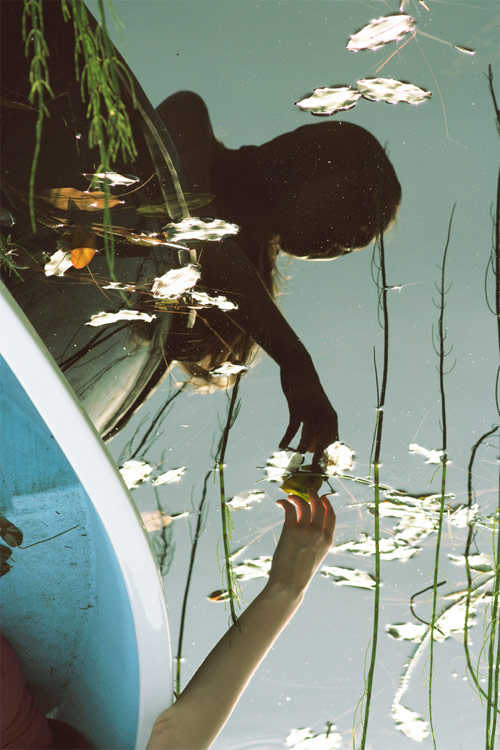
Ilona Olkonen. Here's an image of a girl on a boat. The light in this photograph is natural as she is outside, and the time of the day is perhaps around mid day. This is a coloured photograph, highlighting it's natural feartures, such as the plant's, water, and light. Olkonen has used the technique of reflection not in glass but water, this creates a calm and peaceful atmosphere, howvwer if the image was black and white it would be more peacefull as the colours wouldn't stand out so much,therefore they wouldn't bring the wiever's attention. The main features of the photograph are mainly on the left and middle, leaving the right side of the image spaced out. A movement has been cought in this photograph, therefore a fast shutter speed has been used as if a slow one had been used, the image would turn out blury. The image is not under exposed or over exposed, because the photographer has arranged the shutter speed and aperture perfectly to make a perfect photograph. It has been probably edited unless if the camera shows such vibrant colours as an option. I think the image was purposed to show that peace and calm the wiever, it could also be purposed to encourage the wiever and give them an idea of what to do to get aways from problems. Overally, I like the photograph because it's calming, and besides, the photographer has used an interesting technique, which is the water reflection.
Kasia Bobula.

Emma Hardy.

Emma Hardy.

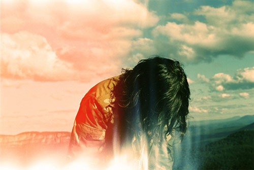
Emma Hardy.

Emma Hardy.
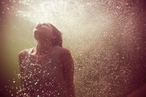
Jeff Haris.

Daniel Jackson.

Ellen von Unwerth.
 Ken Russell.
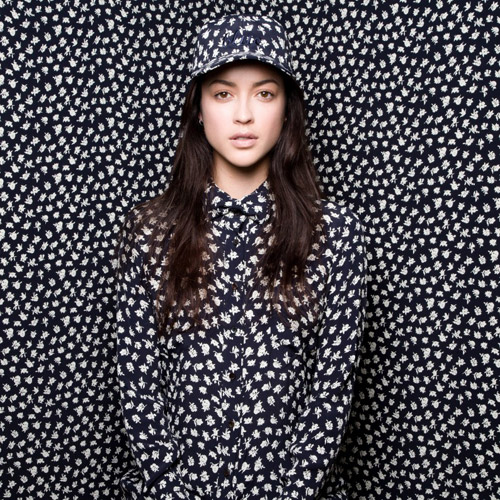
Twenty - Seven Names
Travis Summer Deuel.
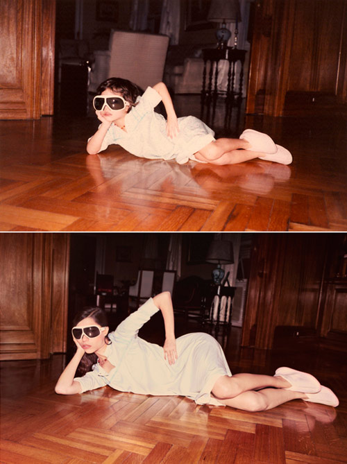
Irina Werning.

Paolo Roversi.

Paco Rabanne.
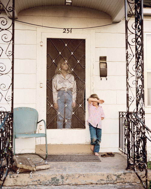
Jo Ann Walters.
Ryan Thomas Kenny.
No comments:
Post a Comment